
Last Updated: July 12, 2024
It’s no secret that color plays an important role in our emotions, which is why choosing the right ones to represent your business is no small decision.
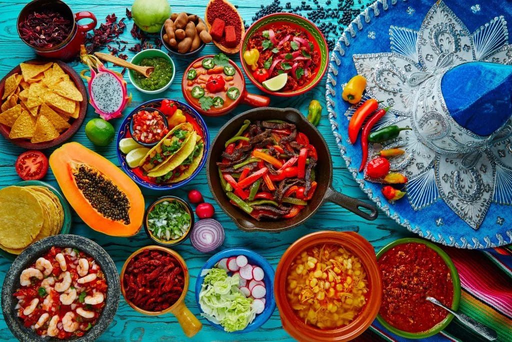
In general, red tends to be one of the most popular choices for food businesses because it has been scientifically proven to stimulate appetite. That’s why so many popular restaurant chains, from McDonald’s to Applebee’s, use this color in their branding.
Of course, you’re not limited to using red for your food business. With a world of color out there, it’s easy to get overwhelmed by the amount of options available.
That’s why we’ve narrowed down the top colors and color combinations to take some of the stress out of making your decision. Read on to learn more about color psychology, color schemes, and get expert insights into choosing the best colors for your food business!
The Importance of Color Psychology for Food Businesses
Charles Spence, a food scientist and professor at Oxford University, did extensive research on the psychological effects of food color. What he learned was this: “Color is the single most important product-intrinsic sensory cue” for setting someone’s expectations of how any given food or drink might taste.
Color has a powerful impact on how we view food and by extension, food businesses.
It’s crucial to understand how color influences the way we view food to pick the best ones for your business.Some colors are better for certain types of food businesses than others, and some colors are generally considered poor choices no matter what kind of food you sell
Red
Apart from making you feel hungry, red has also been known to stimulate the heart rate and blood pressure. This high-energy color is a favorite of fast food businesses because of its high customer turnover.
Use red to evoke:
- Energy
- Passion
- Excitement
- Appetite stimulation
Food businesses that use red in their branding:
- McDonald’s
- Coca-Cola
- KFC
- Dairy Queen
- Heinz
Orange
Being close to red, orange is also known to be an appetite stimulant. Beyond that, it’s often associated with friendliness and can make your food business feel inviting to customers.
Use orange to evoke:
- Warmth
- Cheerfulness
- Enthusiasm
Food businesses that use orange in their branding:
- Fanta
- Sunkist
- Orange Julius
- Buffalo Wild Wings
- Whataburger
Yellow
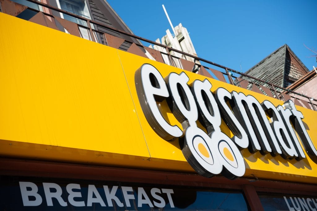
Yellow is another one of the most popular colors to see in food branding and for good reason—it’s bright and attention-grabbing! It’s also associated with hunger and because of its frequent use in fast food brands, it can send a message of affordability.
Use yellow to evoke:
- Happiness
- Optimism
- Affordability
Food businesses that use yellow in their branding:
- Subway
- Lay’s
- Denny’s
- Waffle House
- Chiquita
Green
While green may not be associated with boosting appetite, it’s still a very popular color choice for food businesses. Typically, health food, organic, and vegan/vegetarian food businesses will incorporate green in their branding because it’s associated with health and environmental consciousness.
Use green to evoke:
- Freshness
- Health
- Nature
- Sustainability
Food businesses that use green in their branding:
- Whole Foods Market
- Green Giant
- Sweetgreen
- Nature Valley
- Panera Bread
Blue
Blue is a tricky color in food business branding. It’s known to be an appetite suppressant because of how rarely blue foods are found in nature, so our brains aren’t primed to associate this color with hunger.
However, don’t let that discourage you from using it! If you own a seafood business, blue can be a great way to signify purity and freshness because it reminds people of clean water. You can also use blue as an accent to create an interesting contrast with your main business color.
Use blue to evoke:
- Purity
- Freshness
- Calm
- Trust
Food businesses that use blue in their branding:
- Aquafina
- Oceanspray
- Philadelphia Cream Cheese
- Red Lobster
- SeaPak
Purple
Purple has been associated with royalty for thousands of years, so if you want to send a message of decadence to your customers, this color is a great option. It’s a favorite of confectioners and other sweet treat-makers (think Cadbury and Milka).
If you’re using purple in your branding, opt for warm tones instead of cool ones. The warmer the hue, the more appetizing it’ll appear.
Use purple to evoke:
- Luxury
- Decadence
- Sophistication
- Elegance
Food businesses that use purple in their branding:
- Cadbury
- Crown Royal
- Milka
- Purple Cow Ice Cream
- Ribena
White
White is a go-to neutral for food businesses. If you’re aiming for a minimalist aesthetic, using white in your brand colors is a great way to send a message of simplicity and elegance to your customers.
It’s also a favorite of dairy businesses, like ice cream and frozen yogurt shops, because it reminds people of the color of cream.
Use white to evoke:
- Simplicity
- Elegance
- Purity
Food businesses that use white in their branding:
- Silk
- Chobani
- Fage
- Stonyfield Organic
- Dove Ice Cream
Black
Similar to white, black is an excellent choice for conveying elegance and sophistication in your branding. Upscale restaurants often incorporate black to create a luxurious ambiance. You can also find this color used frequently by gourmet and high-end food brands.
Use black to evoke:
- Elegance
- Sophistication
- Luxury
Food businesses that use black in their branding:
- Guinness
- Kettle Brand Chips
- Jack Daniel’s
- Godiva
- Lindt
Brown
Food businesses that want to send a message of rustic wholesomeness should consider using brown in their branding. It’s also a go-to choice for coffee shops, chocolatiers, and bread bakers because of its association with the colors of those foods.
Use brown to evoke:
- Earthiness
- Reliability
- Wholesomeness
- Warmth
Food businesses that use brown in their branding:
- Hershey’s
- Kellogg’s Nutri-Grain
- Quaker Oats
- Peet’s Coffee
- Nutella
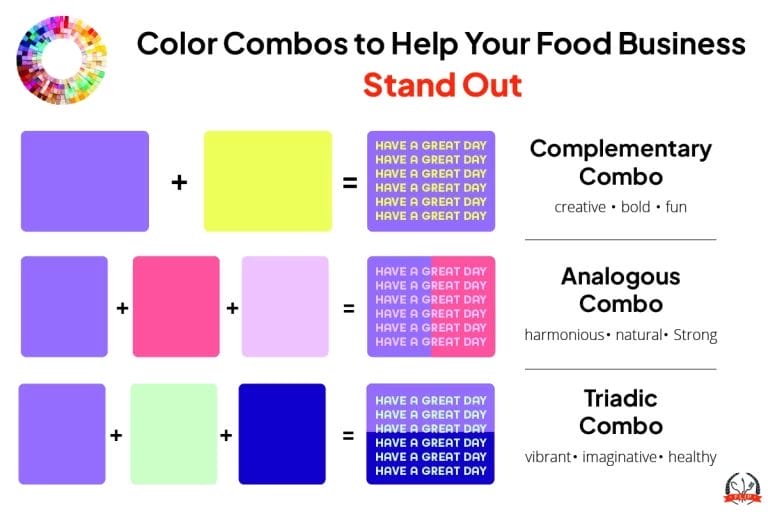
Best Color Combinations for Food Businesses
There are three types of color combinations commonly used in food business branding: complementary, analogous, and triadic.
Each combination can evoke a different feeling in your customers, so choose a combination that matches the emotion you want them to associate with your food business.
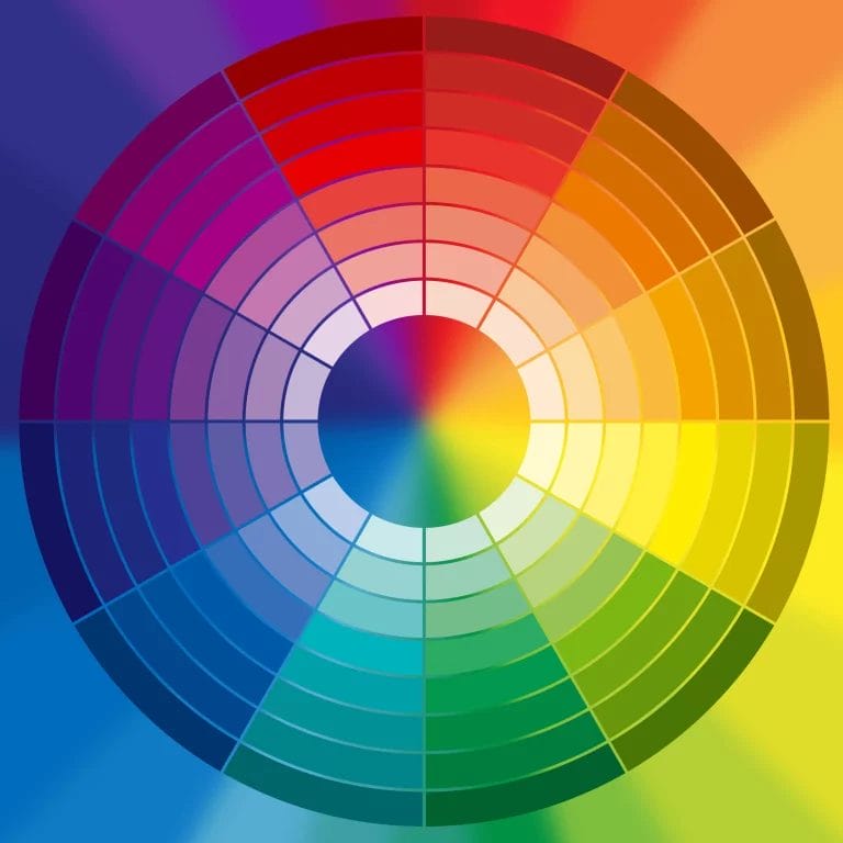
Complementary Color Scheme
Complementary colors are those that are opposite from each other on the color wheel. Examples of complementary colors include red and green, blue and orange, and yellow and purple.
While most people think of complementary color schemes involving bright, bold colors, using muted hues or neutrals can elevate your branding.
Red + Yellow
- Feelings: hunger, playfulness, energy
- Best suited for: fast food, fast-casual food, concessionaires, food trucks
- Example: McDonald’s
Red + Green
- Feelings: energy, excitement, stability
- Best suited for: fast-casual food, concessionaires, food trucks
- Example: Chili’s
Purple + Yellow
- Feelings: excitement, confidence, playfulness
- Best suited for: baked goods and desserts, fast-casual food, concessionaires, food trucks
- Example: Cadbury
Orange + Blue
- Feelings: energy, excitement, playfulness
- Best suited for: fast food, fast-casual food, concessionaires, food trucks
- Example: Fanta
Red + Gold
- Feelings: stability, confidence, excitement
- Best suited for: fast food, baked goods and desserts, fast-casual food, food trucks
- Example: Häagen-Dazs
Analogous Color Scheme
An analogous color scheme usually involves three colors that are next to each other on the color wheel. For example, green, blue, and purple are analogous colors.
This combination could also include shades of the same color instead of three different colors. A food business that uses red, light orange, and dark orange in its branding is a good example of this.
Green + Brown
- Feelings: health, harmony, comfort, serenity
- Best suited for: health food, tea and coffee, vegan/vegetarian food
- Example: Starbucks
Green + Yellow
- Feelings: serenity, harmony, health
- Best suited for: health food, smoothie and juice, vegan/vegetarian food
- Example: Nature’s Path Organic
Red + Orange + Brown
- Feelings: comfort, harmony, strength, health
- Best suited for: health food, tea and coffee, vegan/vegetarian food
- Example: Chipotle
Green + Yellow + Brown
- Feelings: serenity, harmony, health
- Best suited for: health food, smoothie and juice, vegan/vegetarian food
- Example: Sweetgreen
Brown + Yellow + Orange
- Feelings: serenity, comfort, harmony
- Best suited for: health food, tea and coffee, vegan/vegetarian food
- Example: Peet’s Coffee
Triadic Color Scheme
Triadic color schemes are made up of three colors evenly spaced around the color wheel that form a triangle. Red, blue, and yellow is a classic triadic color scheme.
Much like complementary color schemes, you can incorporate muted hues and neutrals for a more sophisticated feel instead of relying solely on bold and bright colors.
Blue + Orange + Green
- Feelings: cheerfulness, optimism, imagination
- Best suited for: desserts, food trucks, ice cream, smoothie and juice, concessionaires
- Example: Dippin’ Dots
Blue + Green + Brown
- Feelings: comfort, sophistication, optimism
- Best suited for: cafes and bistros, desserts, food trucks, ice cream, health food, bartending
- Example: Ben & Jerry’s
Red + Yellow + Blue
- Feelings: warmth, cheerfulness, optimism, imagination
- Best suited for: desserts, food trucks, ice cream, concessionaires
- Example: Froot Loops
Purple + Yellow + Red
- Feelings: comfort, warmth, sophistication, cheerfulness
- Best suited for: cafes and bistros, desserts, food trucks, ice cream, smoothie and juice, concessionaires, bartending
- Example: Taco Bell
Red + Green + Yellow
- Feelings: comfort, warmth, cheerfulness, optimism, imagination
- Best suited for: cafes and bistros, desserts, food trucks, ice cream, smoothie and juice, concessionaires
- Example: Lucky Charms
Tips for Choosing the Perfect Color Palette for Your Food Business
Now that you know a little more about the psychology behind different individual colors and combinations, here are some tips to help you choose the right color scheme for your business!
Keep It Simple
Don’t go overboard — try to keep your branding limited to no more than two or three colors. You can always accent with neutrals like black or gray, but using more than three main colors will make your logo feel busy and messy.
While it may feel restrictive at first, limiting the number of colors for your food business will make it easier for you to incorporate your branding in your website, signage, and beyond. It also promotes brand recognition because it’s easier for people to remember two or three colors that represent your business versus four or five.
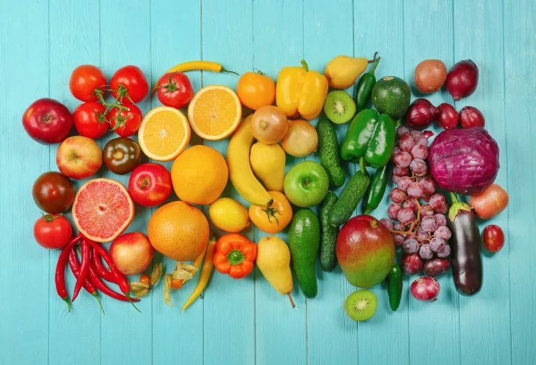
Take Inspiration From Your Food Products
Incorporating colors from your product is smart branding because it can signal exactly what kind of food you make to potential customers.
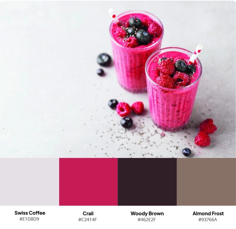
For example, if you’re starting a smoothie business, you can use berry hues in your branding to evoke the ingredients you use.
To get ideas for which colors you might pick, try using this color palette generator from Canva! Simply upload a picture of your food and watch as it generates four colors from the image. The best part? The generator gives you the HEX codes for each color it selects, so if one or two of them speak to you be sure to record the codes for future use!
Do Competitive Research
Understanding what colors your competitors are using is essential to picking the right ones for your business. Opting for a color palette that is too similar to that of another business in your area can harm you in the long run because you won’t stand out to potential customers.
Of course, this is easier said than done when certain colors are favored by certain types of food businesses. If you run a pizza food truck, there’s a high likelihood that other pizza food trucks in your area will be using red as one of their primary brand colors.
If you find yourself in a situation like this, it doesn’t mean you have to avoid red entirely. Instead, experiment with different saturations and tints to set your business apart. If one of your competitors uses a bright red in their brand colors, you could opt for a darker, richer burgundy hue.
Test Your Colors
You don’t have to commit to one palette right away! Try sourcing feedback from customers, friends, and other people you trust before making an official decision.
To do this, use platforms like SurveyMonkey and Google Forms to collect input. Ask specific questions about peoples’ preferences and perceptions of each palette to get a good feel for which one best represents your brand identity. Look for patterns in the responses you get.
Color Deficiency (Color Blindness) Considerations
A whopping 1 in 8 men and 1 in 200 women have some sort of genetic color deficiency trait, meaning that they see certain colors differently than others. Or, in rare circumstances, they don’t see color at all.
To make your logo or color palette relevant for this demographic, be sure to use high-contrast colors.
Also, many businesses are increasingly using “double coding” that incorporates patterns and symbols alongside color. A good example of double coding is Amazon’s logo. While the colors may look different to some, the smile embedded in their ubiquitous emblem can be recognized by everyone who can see it.
Next Steps For Your Food Business Colors
Once you’ve picked your food business colors, it’s time to start integrating them into your overall business strategy.
Design Your Logo
Your logo is one of the first places customers will encounter your brand colors. Make sure it’s a versatile design that works in both small and large formats, or create a simple version that can be sized down without losing important elements.
You can create your own logo on Canva, but a professional designer will be able to create something truly unique and special for your business. If you’re on a tight budget, get help from professional freelance designers on platforms like Fiverr and Upwork.
Update Your Signage and Product Presentation
If you use menu boards or signs as part of your business, add your brand colors to them. Additionally, if you and your staff wear uniforms, make sure that apparel coordinates with your brand colors.
Packaging is another great opportunity to use your colors. Services like PakFactory and UPrinting allow you to create custom takeaway bags, boxes, and containers that you can accent with your logo and color palette.

Incorporate Them Into Your Online Presence
Having an online presence is one of the top marketing strategies for any food business, and it works best when your branding is consistent across your website and social media accounts.
Update your website to match your new color scheme. Everything from the background to buttons can be used to reflect your brand colors. Just make sure you’re not overdoing it with too many bold, bright hues. If you have any in your palette, use a neutral background to help your primary brand colors pop.
Whether you’re marketing your food truck or promoting your at-home bakery business, having a cohesive social media presence is critical to your success!
- Use your logo as your profile picture across Facebook, Instagram, TikTok, and other platforms you’re active on.
- Incorporate your brand colors or your logo into photos and videos that you post.
- Take pictures of your food and beverage items against a backdrop that features your brand colors or logo.
- On Instagram, create branded covers for your Story Highlights.
For more tips on how you can use your brand’s color palette on social media, claim your free copy of our eBook, How to Make Your Food Business Stand Out on Instagram in 2024!

By Alex Hastings
Alex is a Marketing Copywriter at Food Liability Insurance Program (FLIP). In her free time, she enjoys reading, birding, traveling, and finding any excuse to get brunch.